UI Layouts in Spacial Technologies

This layout is too wide. It goes beyond the FOV.

To solve the problem, we could scale down the elements. But that would reduce the font size.

We could also move the UI further, but that might cause problems like:
The text becomes hard to read due to the distance.
UI intersects the models.

What we want is to redesign the layouts.
Keep the size and the distance and make sure the text is easy to read. However, if all the elements are on the same canvas, text on the sides would look stretched and become blurry.
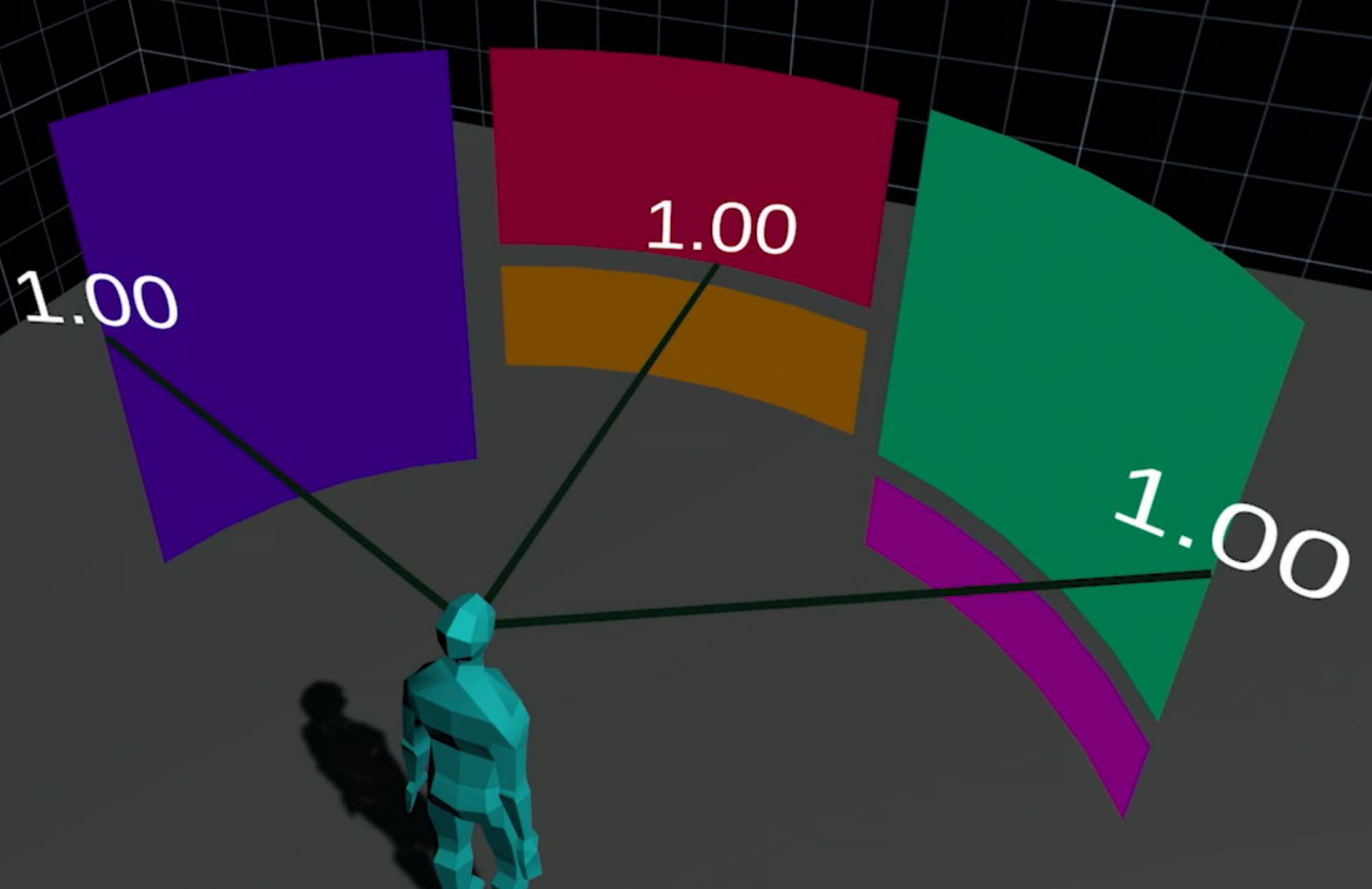
Thus, it's better to make sure that the elements are around the user displayed in the same distance.
But this column-like design might not fit the style of some experience.

So we also use a folded canvas design.
Examples:

From Space Pirate Trainer
From Beat Saber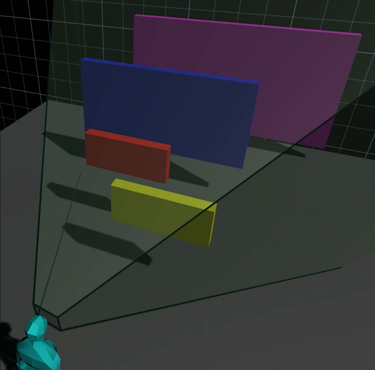
Since we use world space to design UI for spacial technologies, it might be interesting to take advantage of the Z-Axis.

But we need to make sure the distance between each layer is short enough, so every layer is readable.
